


 Book a meeting
 Book a meeting

10 visualisations that changed the world of information design
Great design is about substance as well as style. In thought leadership, this is especially important. With a focus on data and storytelling, design and data visualisation is the obvious missing element of the classic thought leadership recipe, and if done correctly it can elevate a content campaign from good, to great.
With this and the launch of FT Longitude’s new information design offering in mind, I have compiled a short list of history’s most famous data visualisations – they are either important to the information design as a practice, or they have been vital to my journey as an information designer.
A New Chart of History (Joseph Priestley, 1769)
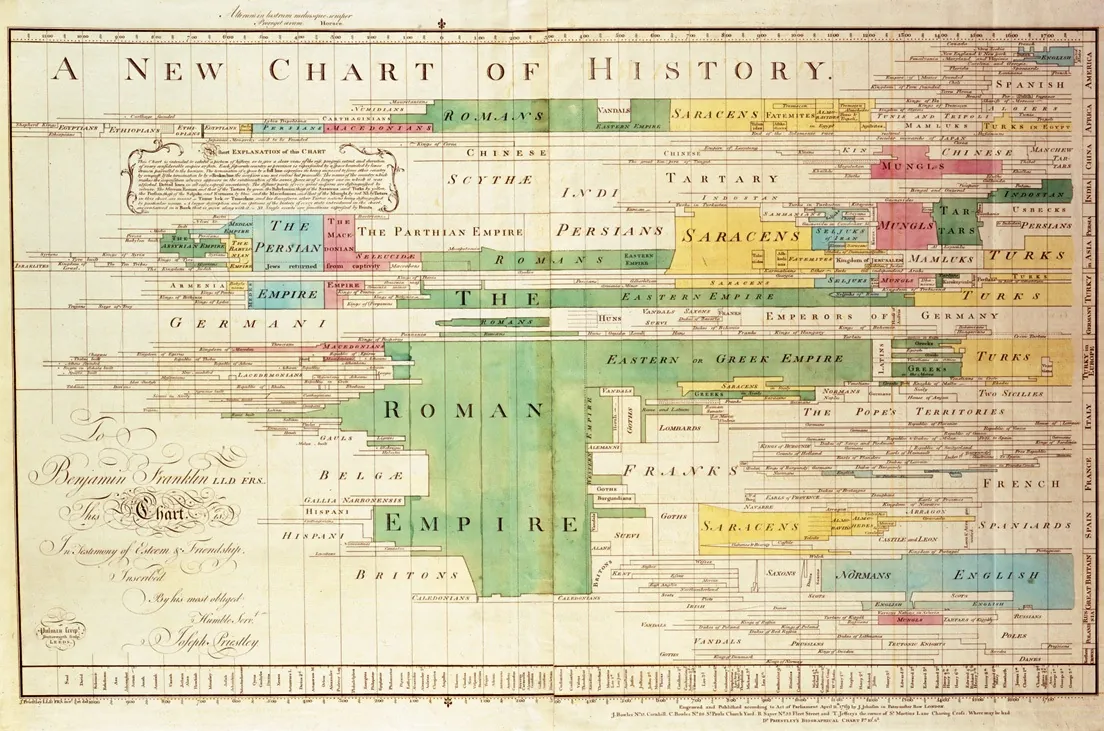
British polymath, Jospeh Priestley originally published A New Chart of History as a supplement to his Lectures on History and General Policy, but very quickly became a standalone premier example of early data visualisation. The chart timelines major empires and cultures through history and is a rich visual story which was hugely innovative and creative at the time – a landmark in the information design.
Napoleon’s Russian Campaign (Charles Minard, 1812)
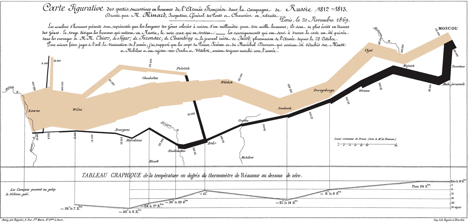
Charles Minard is a French engineer most well known for his graphic depiction of Napoleon’s disastrous losses, in map form. The graphic is notable for its representation in two dimensions of six types of data: number of Napoleon’s troops; distance; temperature; latitude and FT Longitude; direction of travel; and location relative to specific dates. In fact, this map is one of the data visualisations that inspired me to become an information designer, and is a brilliant example of how a complex story can be told as simply as possible.
The Causes of Mortality in the Crimean War (Florence Nightingale, 1857)
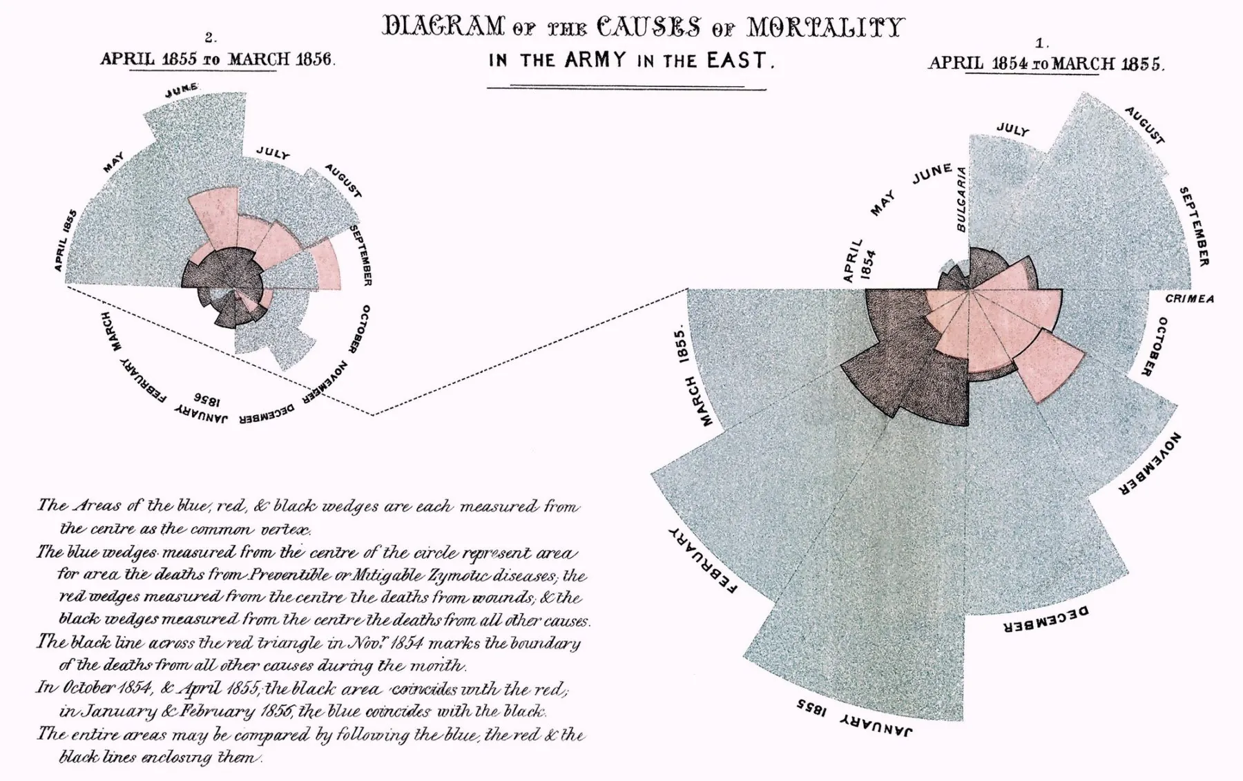 Florence Nightingale might have saved millions of lives by developing a new form of pie chart – known as the Nightingale Rose, or the polar area diagram – showing the number of deaths in the Crimean War from battle, compared to disease or preventable causes that could be reduced by better battlefield nursing care. Taking in to account an astounding 10 different variables, it revealed a number of useful insights at the time, most notably that disease was indeed the biggest killer in the British Army, and the appointment of a sanitation officer did actually work.
The 1854 London Cholera Outbreak (John Snow, 1860)
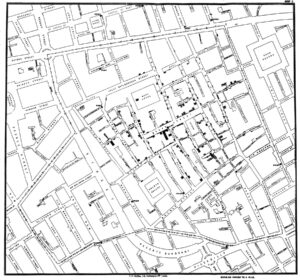
English physician, John Snow created this dot map visualisation using small bar charts superimposed on a bird’s eye view of the area around the infamous Broad Street water pump during the 1854 outbreak – the bars represented the number of cholera deaths at each household. It’s an incredibly simple concept that had real impact, when he used the map to prove that the households who suffered the most were all using the same contaminated well for drinking water.
Out of Sight, Out of Mind (Pitch Interactive, 2013)
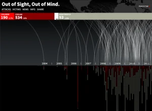
A more modern-day visualisation. Pitch Interactive used publically available data to document every drone strike carried out in Pakistan since 2004 – graphing the narrative by date, location and fatalities incurred. The resulting visualisation was used to effectivley helped inform the public about the scale, severity and proliferation of drone strikes at the time, and left a last impact on me.
The Infographic History of the World (Valentina D’Efilippo, 2013)
Rather than just one visualisation, author Valentina D’Efilippo created a whole book of infographic visualisations to cover the world’s lifespan of 13.8 billion years in 100 infographics. This is a must-read for information designers and shows how a vast amount of data can be effectively distilled into more manageable chunks. A picture tells a thousand words, after all…
After Babylon (Puff Puff Project, 2014)
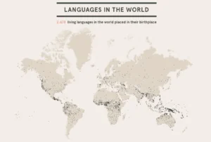
How do you explore and visualise the world’s 2,678 living languages? After Babylon uses an impressive set of interactive maps and graphs to help analyse the “current linguistic situation in the world” today. The scrolling story plots where these languages originate, where they are spoken, and how many speak them, and acts as a great exploration tool centering around a deep analysis of various ‘loanwords’ between languages, helping to highlight relationships and links worldwide.
Bussed Out (Nadieh Bremer & Shirley Wu, 2017)
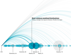
A fantastic example of a scrollable story presented by The Guardian on how America moves its homeless population. This is a fantastic example of a scrolling story presented by The Guardian on how America moves its homeless population, using animated data viz, video and photography to illustrate an emotionally-charged piece of data-led editorial. Without data, this story would have been powerful. But by using information design, this article is a step above.
Life in the camps (Reuters, 2017)
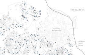
Another powerful scrolling story, beautifully executed with a strong set of data visualisations that tell the story of life in the refugee camps in the Rohingya province of Bangladesh. Makeshift huts crammed onto muddy hillsides, contaminated water wells, rapidly spreading disease and many other factors meant this must have been a challenge to report on, but the inclusion of data visualisation eases the emphasis on text, and allows the viewer to absorb the message quickly and effectively.
An Alternative Data-driven Country Map (Nikita Rokotyan, 2019)
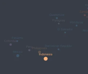
A conceptually simple visualisation – spectacularly executed with the help of machine learning and AI – this map is easy to use and find previously-unseen connections and harmonies between different countries. The map is constantly changing and updating, using a myriad of different metrics to let us see the world in a whole new light.
Sign up to the newsletter
We help organisations stand out, speak with authority and spark inspiration, so change can happen. That’s real intelligence with influence. Sign up to our newsletter to get regular updates.
Subscribe