FT Longitude picks: Three thought leaders embracing digital to tell their stories
To get noticed in the digital era, those producing thought leadership content need to think as much about the visual presentation as about the content itself.
How many of us have time to wade through a 10,000-word report to pick out the information most relevant to us? Even if the content is high calibre, does a staid PDF that lands in your inbox still stand a chance of grabbing your attention?
That is not to say that brands should dismiss the idea of producing in-depth, comprehensive research tackling the burning issues in their market – far from it. But the bar has been raised in terms of how that content must be delivered to the reader. The race is on to find increasingly compelling ways to tell your story.
In this post, we pick out three excellent examples of brands that are taking an innovative approach to digital content. These brands are bringing data to life for their audience, and are driving home their message with high impact.
Savills Tech Cities

Visualising their story
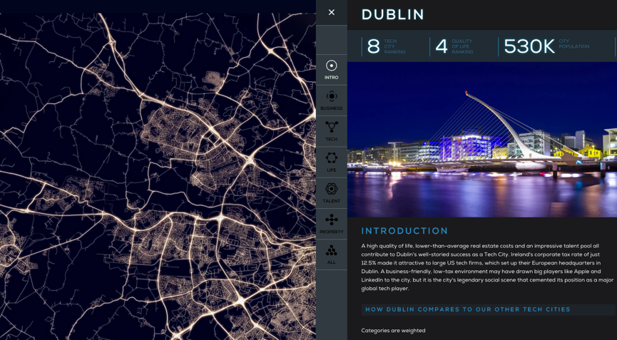
Savills has created a slick microsite to host its 2015 Tech Cities research, picking out 12 global cities with attributes that are attractive to tech businesses.
Readers can easily navigate to their city of interest, then explore how it measures up against key indicators, such as the quality of its broadband networks, quality of life, and level of tech-savvy talent.
The information is easy to browse and digest, and readers get an overview of the research findings in a clearer and far more compelling way than a traditional executive summary, for instance, might provide.
Improving the reader experience
The succinct use of text is very effective in enabling readers to digest key facts quickly, and the microsite links through to Savills’ further research and commentary on the topic for more in-depth analysis.
One area for improvement, however, is context: the microsite could provide readers who are less familiar with Savills’ research with, for example, some short introductory text outlining the research and its methodology. This needn’t detract from the visual appeal – it could pop up as mouseover text, for example – and it would provide important context up front for readers exploring the data.
L.E.K Global Consumer Insights

Visualising their story
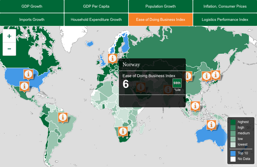
L.E.K. Consulting has built an interactive map that uses annual data from the World Bank to illustrate country trends impacting retail and consumer goods firms seeking to expand overseas.
It engages the audience by enabling the reader to tailor the ranking of countries by key indicators such as GDP growth, import growth, and ease of doing business.
As the reader hovers over their country of interest, a click-through option appears linking to a short PDF with tailored content for that market, such as ‘Understanding the European Consumer’. This is a smart way of steering engaged readers to a second level of content that resonates with their needs.
Improving the reader experience
L.E.K.’s digital map reminds us of an important lesson of creating interactive content: beware browser incompatibility. While the functionality is perfect with most web browsers, it falls down on others – leaving the reader confused or frustrated, as they miss out on valuable information.
IBM Redefining Boundaries: The Global C-suite Study


Visualising their story
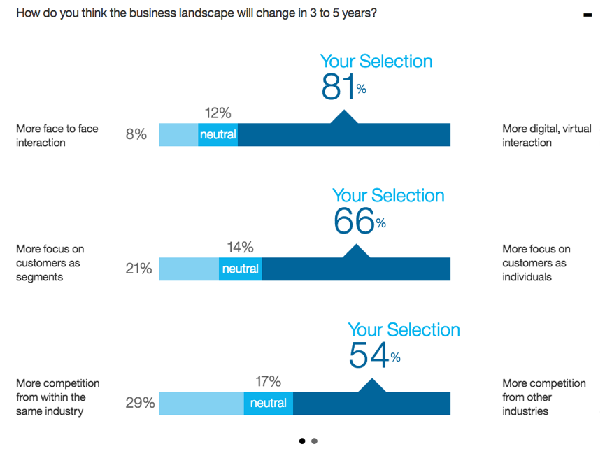
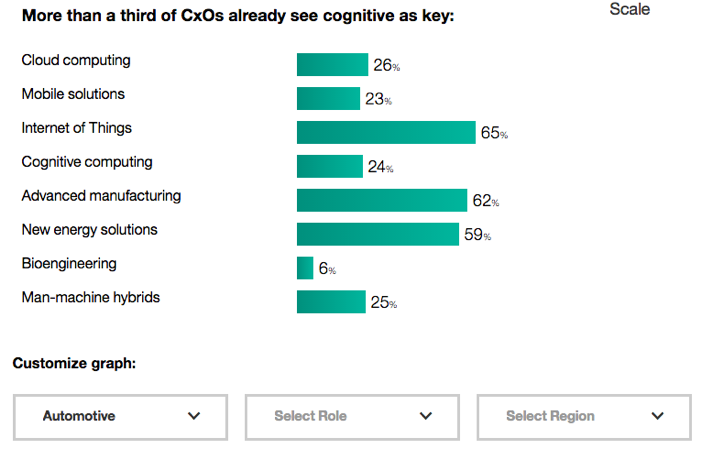
IBM makes use of the wealth of C-suite data it has collected in its global study – from over 5,000 face-to-face interviews – to give readers the opportunity to customise the findings.
The landing page for the research has customisable charts for each key finding, as well as a personal benchmark that enables readers to rank themselves against their peers in the same industry, region and C-suite function.
These tools bring the survey data to life for the reader in a way that a traditional report introduction or executive summary couldn’t. The reader is engaged upfront, and is then taken on a tailored journey of content discovery through more in-depth targeted reports, articles and points of view.
Improving the reader experience
One of the great things about online benchmarks is that they enable you to gather quite a lot of information about the reader and what is important to them. It may be possible here for IBM to go a step further, and create even more personalised outputs for those readers that complete the benchmark. For example, individualised mini-reports based on their answers, including tailored insights and commentary from IBM executives and other leaders in the industry, could add even more value for readers.
Putting your audience in the picture
These are just three examples of brands experimenting with digital tools to bring their thought leadership to life. What they show is that an innovative digital approach is increasingly important in winning the audience’s attention; fail to embrace this change, and you may find that your 10,000 words struggle to compete with these information-packed visuals.


 Back
Back

 Book a meeting
 Book a meeting

