Data visualisation: The pictures that are worth a thousand words
Research shows that people share and engage with infographics up to three times more than with other types of content. But what makes good data visualisation and how does it apply to thought leadership?
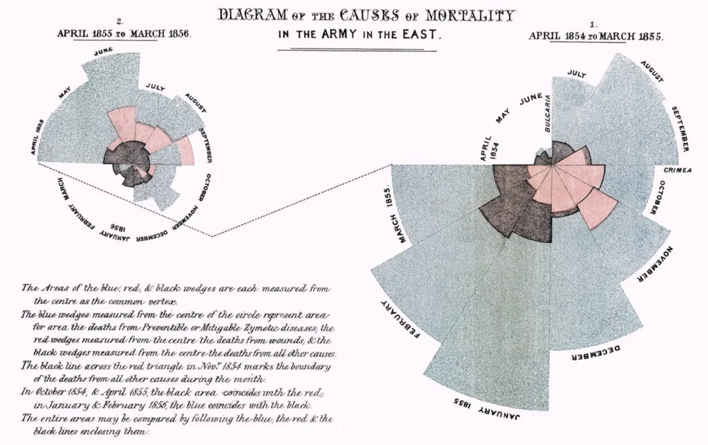
Florence Nightingale is best known as the founder of modern nursing, but what many don’t realise is that she could also claim to be the founder of what we call data visualisation. Her most famous design, the ‘coxcomb’, conveyed complex information about the causes of mortality in Crimean hospitals in a way that clearly showed how better sanitation meant fewer deaths.

Early infographics by Florence Nightingale: Causes of mortality in Crimean hospitals
Almost two centuries later, the volume of data we have to process and understand has grown to a level that even accomplished statisticians like Nightingale could never have imagined. Today’s business audiences face a huge challenge in making sense of complex data, as constant information overload leaves them little time to process it.
Data visualisation and thought leadership
In thought leadership, data visualisation can be a powerful form of shorthand. A good graphic can communicate complex concepts simply and quickly, either replacing or supplementing large amounts of text.
In his 2010 TED talk, David McCandless, author of Information is Beautiful, explains that the best data visualisations reveal patterns we wouldn’t otherwise see.. It’s about “solving information problems”, he says.
There are plenty of statistics that illustrate how much easier it to process visual, rather than written, information:
• 65% of us are ‘visual learners’
* 90% of the information that is transmitted to our brains is visual
* Our brains can process images that we are shown for just 13 milliseconds
* Visual images are more likely than text to stick in our long-term memory.
Beyond the science, data visualisation has important advantages from a content marketing perspective. People share and like infographics up to three times more than other content. They boost search engine visibility and typically increase dwell time compared with text-heavy pages.
What makes good data visualisation?
In our view, good examples of data visualisation share the following 8 characteristics:
1. They have a simple concept
The best examples have a message that can be understood in a matter of seconds. This is essential in a thought leadership context, when you may only have your audience’s attention for a short period of time. They distil complex information into something straightforward. David McCandless’s The Billion Dollar-o-Gram, which compares large sums of money such as spending on the Iraq War, total global foreign aid and Walmart’s revenues, is a great example of this.
2. They save time
Note, however, that a simple concept is not the same as simple execution. Some highly successful infographics have straightforward concepts but contain a lot of information that can take a long time to digest. The point is that the concept is concise and saves the audience time, compared with having to absorb the same amount of information in text format.
3. They have a clear rationale
Data visualisation experts often distinguish between explanatory graphics and exploratory ones. The former focus on telling a clear story by design, while the latter avoid a single narrative and encourage audiences to explore the data and uncover unexpected patterns themselves. Both techniques are valid, but they demand quite different methods, so information designers must decide on their approach right from the start.
4. They get creative with their charts
The best information designers dispense entirely with traditional charts, such as pie charts and bar charts, and come up with less familiar ways of presenting data. This gets their graphics noticed and, more importantly, introduces much-needed variety into the presentation of data. For inspiring charts to incorporate into your data visualisation, visit datavizproject.
5. They are non-linear
Basic infographics are consumed in a linear fashion: from top to bottom, as though reading a page of text. These types of infographics can be effective, but they won’t win any prizes for innovation. Rather than simply replacing words with pictures on a top-to-bottom page, the most creative data visualisation tends to be non-linear in structure and more conceptual.
6. They avoid distortion
One trap we sometimes see companies falling into is visualisation that distorts the underlying data. It’s easy to manipulate data using graphics – by adjusting scales on charts for example. While this might allow companies to highlight a message that suits their needs, it greatly undermines their credibility when audiences spot this sneaky tactic.
7. They should say something new
In our client work, we apply the same rules to data visualisation that we apply to all of our thought leadership: it must say something new, it must be insightful, and it must add to the conversation. Dressing up a mundane or familiar argument with smart graphics isn’t likely to fool our savvy business audiences.
8. They look good
Elegant design is essential. A simple colour palette, an uncluttered, eye-catching, balanced layout and minimal text are all critical to communicating clearly using graphics. The best infographics rely on Gestalt Theory. This psychological concept explains the way our brains perceive visual arrangements – for example, how we perceive elements that look similar as part of a group.


 Back
Back

 Book a meeting
 Book a meeting

