The visual storytelling tools that give your thought leadership an edge – and six examples of how to use them
Stories matter. They help us to connect with one another and understand our place in the world. And by spreading knowledge and advice, they help us to learn and make better decisions.
The best thought leadership communicates complex ideas simply, and its creativity wins hearts as well as minds. This is where visual storytelling tools come in. Video, imagery, illustrations and infographics can help your content to tell a compelling story that connects with audiences – intellectually and emotionally.
Today’s audiences – that’s your clients and potential buyers – are starved for time, and their expectations are higher than ever. They want to access information quickly, conveniently and in a far more personalised way. Again, this is a where visual storytelling tools can come into their own.
So what exactly do we mean by visual storytelling, and which brands are using the best tools to get it right?
1. Data visualisation
We know that data gives thought leadership a boost. Three-quarters of people in research carried out by the Content Marketing Institute said that content with data is more trustworthy than content without data, and roughly the same proportion said that content with data is more persuasive. But most audiences do not have time (or the inclination) to wade through tables of data or paragraph after paragraph of percentages. So how do you incorporate data in your content in an interesting way?
You bring it to life with data visualisation, which is now a vital component of most B2B content campaigns. Not only does it help you to get across your key messages more concisely, it also engages audiences more effectively and encourages them to explore your content more deeply.
Here are two examples of great data visualisation:
FT coronavirus tracker
This newsroom innovation has been one of the most reliable sources of data and information throughout the pandemic and possibly the most popular pieces of content the FT has ever produced. This timely use of data visualisation to track the course of the pandemic over time, across countries and city hot-spots combines detailed data with creativity to create the kind of content audiences really want to engage with.
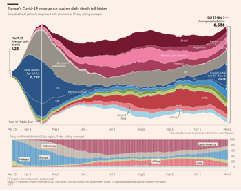 |
● A complex but powerful data tool, designed to be visually simple and intuitive
● Enables easy comparison across data sets ● Tracks changes in the data over time to show spikes and decreases as well as the overall trajectory. |
EY corporate reporting survey data tool
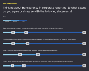 |
● A data-led reporting tool, updated annually, that gives users country and global highlights
● Audiences can create customised views, comparing global data to country-specific responses, or country to country ● Data filters for sector and company size breakdowns provide even greater customisation and combines with easy navigation. |
> Learn more about our approach to data visualisation
2. Interactive stories
Research shows that visual storytelling helps brands to stand out in their audiences’ minds. According to this infographic from HubSpot, 80% of people remember things they see or experience, compared to 20% of what they read and just 10% of what they hear.
Your thought leadership is far more likely to have an impact if it has a strong narrative. And if it provides audiences with an immersive experience, it will deepen their engagement and build emotional connections.
Visual storytelling tools such as interactive stories do not just provide a richer experience for your clients and prospects; they also serve as a central, story-led hub for your campaign. They also enable you to tell your story seamlessly, with a single immersive experience – rather than expecting audiences to piece the narrative together across multiple channels and assets.
Here are two examples of great interactive stories:
FT Covid-19: The global crisis – in data
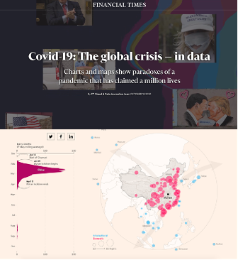 |
● A highly engaging visualisation strategy that tells the story verbally and visually in parallel
● A data-led article with animated data visualisation that activates in line with the story, matching the pace of the reader to show corresponding insights alongside the editorial content ● The inclusion of static and animated visual content makes this a captivating interactive story. |
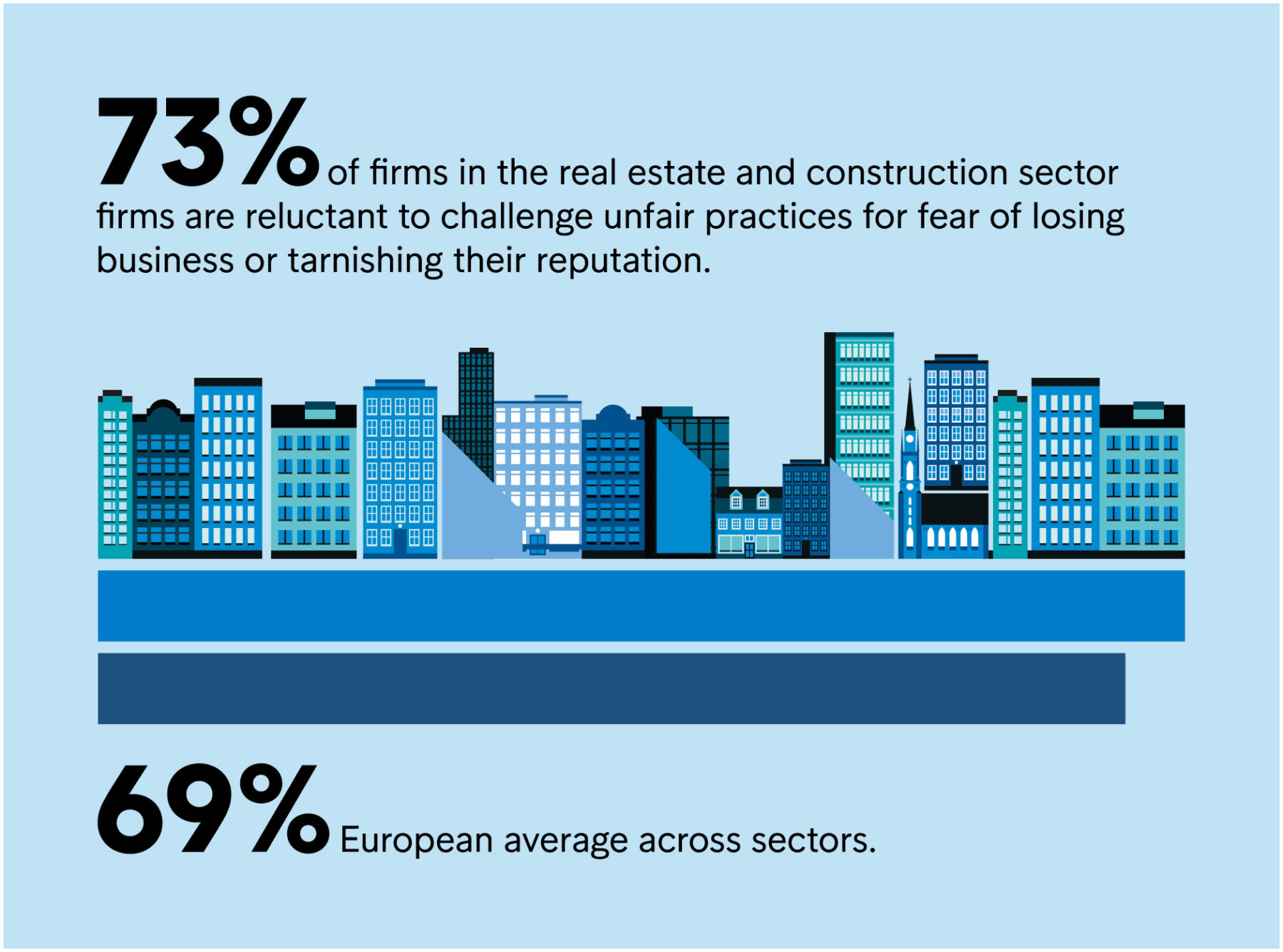
Intrum European Payment Report 2020
|
● An interactive, data-led report optimised for a digital audience
● A clear typographical hierarchy allows readers to skim the content and navigate swiftly between sections ● Inclusion of simple animated, interactive visualisations provide additional insights to support the narrative ● Beautifully illustrated static graphics enhance the overall look and feel. |
> Learn more about our approach to interactive stories
3. Benchmarking tools
In our experience, audiences love to know how they measure up against their peers. Enabling them to interact with research data adds an extra dimension to thought leadership campaigns – and gets from your survey and research investment.
Benchmarks do not just provide a more personalised experience for your audience, they can also increase engagement and encourage deeper engagement as a result.
But the benefits are not limited to marketing tactics. Sales teams can use the data gathered to find out how an individual performed and uncover unmet needs – often providing them with a better ‘way in’ that results in more meaningful conversations. Benchmarks are also an excellent tool to use directly with clients and prospects in one-on-one discussions. In both scenarios, this ‘real-time’ assessment positions your company as an expert and gives your audiences answers to their problems.
Here are two examples of great benchmarking tools:
New Relic More Perfect Software
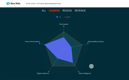 |
● This enables audiences to see how they compare against a defined group of ‘leaders’, as well as other firms in their regions and revenue bands
● It is easy to use and optimised for multiple-choice inputs – the results of which are presented as simple interactive charts to explore in more detail ● The resulting data provides tailored insights and actionable takeaways in the form of smart tips for how to improve the software lifecycle. > |
Simmons & Simmons Big Data Race
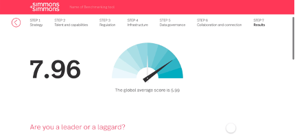 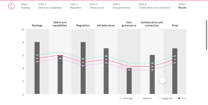 |
● This was built on a survey of more than 350 senior executives to find out how leading companies have turned their assets into breakthrough insights
● Organisations can benchmark themselves against six pillars of data-commercialisation best practice and compare their results with those of their peers ● The tool gives participants a score for each category alongside the global average, and an overall score which places their results against leader and laggard groups for comparison. |
> Learn more about our approach to benchmarking tools
For expert guidance on storytelling tools and how to design high-impact campaigns that win hearts and minds, watch our on-demand webinar with FT Longitude’s Head of Information Design Emma Hicks: access here.
For helpful tips and practical advice on how to maximise creativity and increase engagement in your next campaign, access our Creativity Hacks here.


 Back
Back

 Book a meeting
 Book a meeting

